The How
Colors
We built a structured color system with a consistent static base, flexible species-specific accents, and dedicated data-visualization colors. This approach keeps products unified and accessible while allowing enough variation to differentiate species and highlight key business metrics.
Color Choice Considerations
Color Choice Considerations
Flexibility
Colors adapt across species without breaking the system.
Data First
Colors highlight key information to support fast decisions.
Accessibility
Contrast and clarity ensure every user can read the interface.
Static Colors
The colors remain the same across species, ensuring cohesion and accessible alerts.

Static Colors
The colors remain the same across species, ensuring cohesion and accessible alerts.
Dynamic Colors
Brand colors change by species; accents are optional and can be replaced with neutral blue.

Dynamic Colors
Brand colors change by species; accents are optional and can be replaced with neutral blue.
Data Visualization Colors
These colors address UX needs in graphs, with specific business metrics consistently tied to the same color (e.g., dairy rumination is always purple). Each product can use as many classifiers as needed.

Data Visualization Colors
These colors address UX needs in graphs, with specific business metrics consistently tied to the same color (e.g., dairy rumination is always purple). Each product can use as many classifiers as needed.
Typography
We used Invention (MSD’s official typeface) for titles to maintain brand presence, and Noto Sans for all content to ensure multilingual support, high legibility, and accessibility. This combination kept the interface clear and consistent, even on dense, information-heavy screens.
Typography
We used Invention (MSD’s official typeface) for titles to maintain brand presence, and Noto Sans for all content to ensure multilingual support, high legibility, and accessibility. This combination kept the interface clear and consistent, even on dense, information-heavy screens.

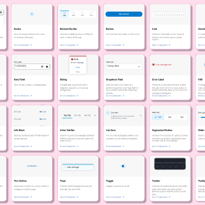
Iconography
We built a structured icon system based on the SenseHub logo, using templates to standardize alignment, proportion, and style. Filled icons offered strong legibility and later evolved into a dual-tone style. Mapping each icon to a template keeps the entire set consistent and easy to use across products.
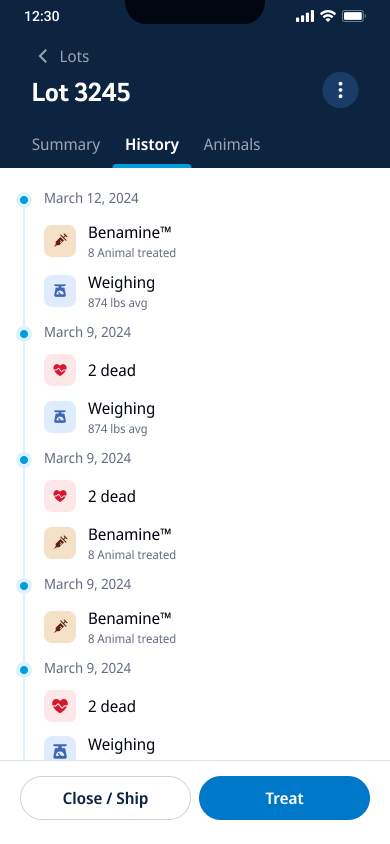
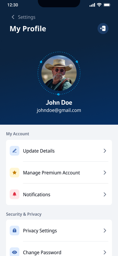
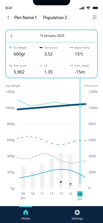
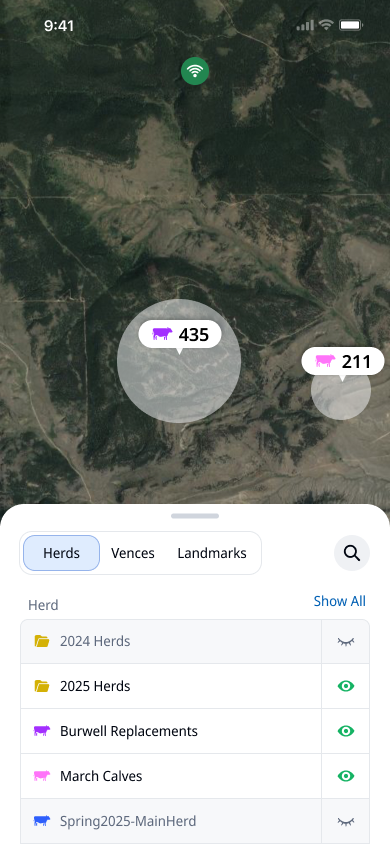
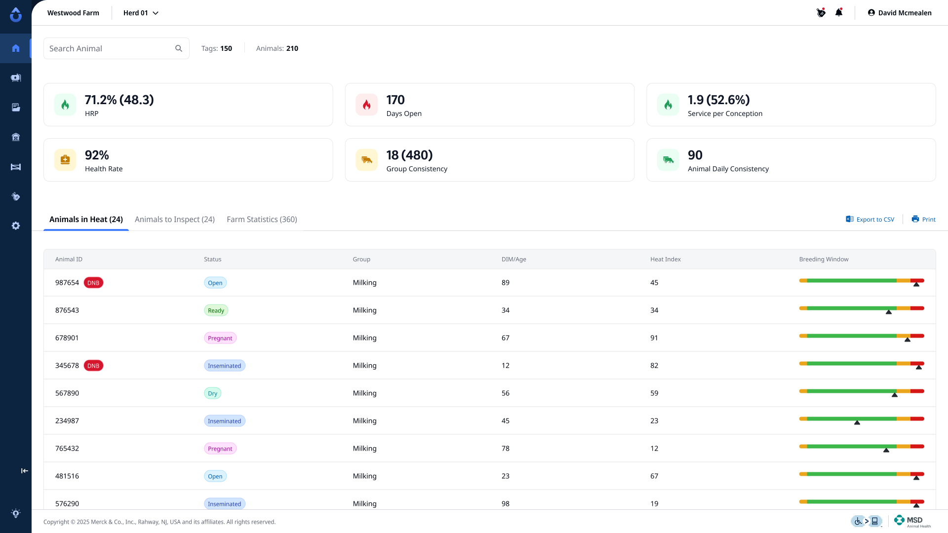
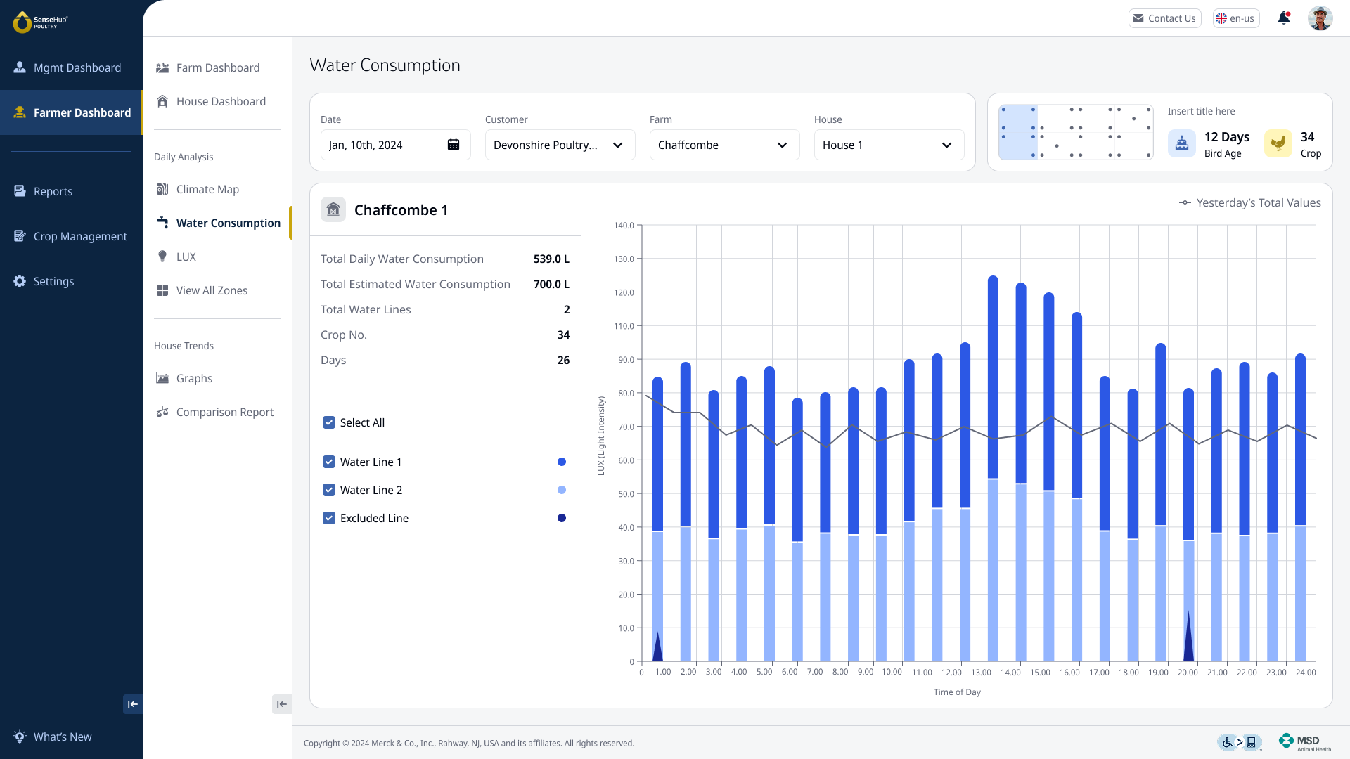
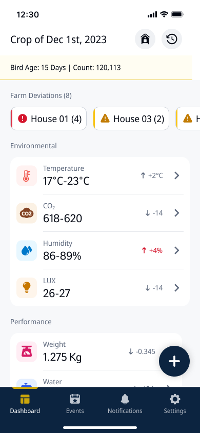
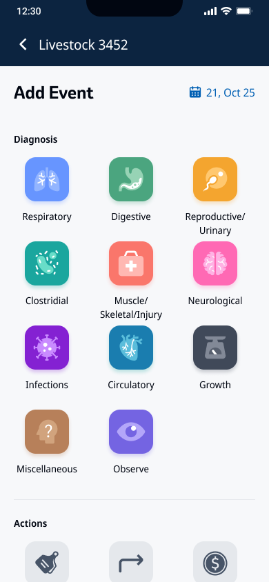
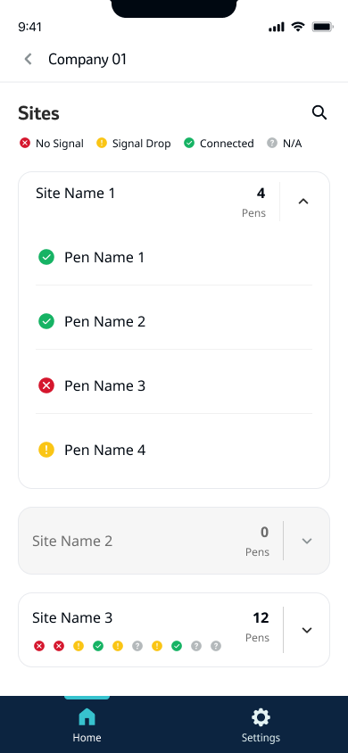
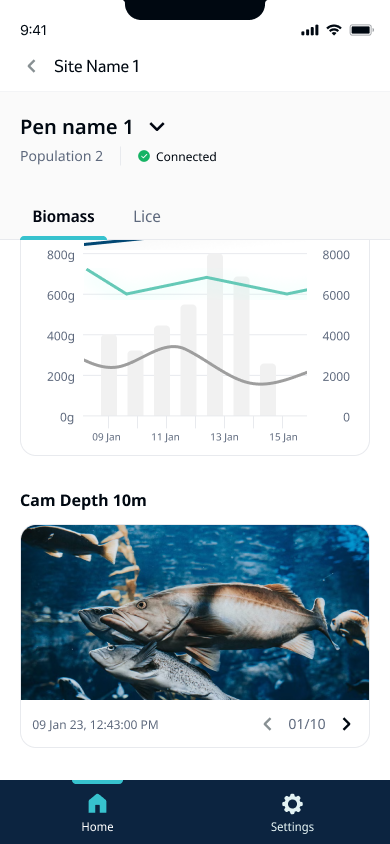
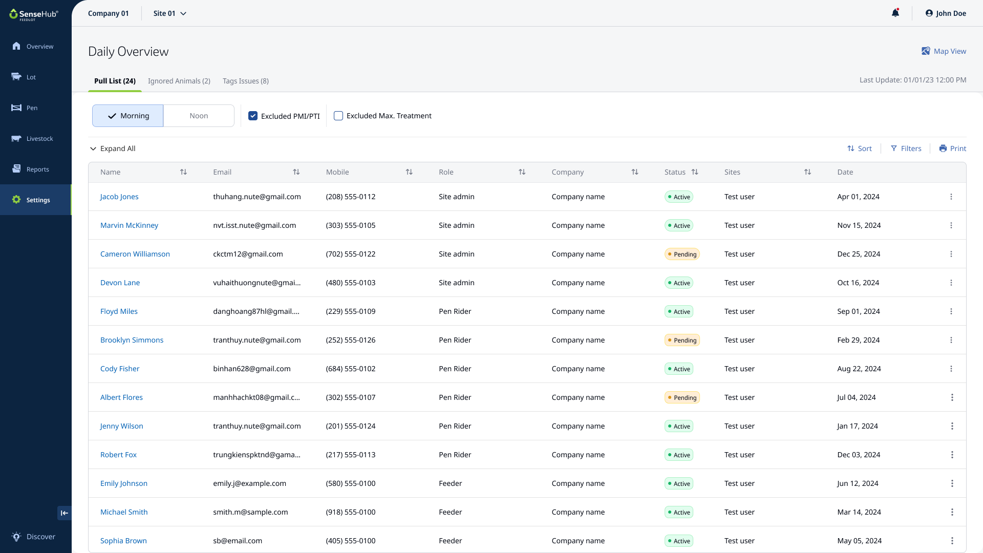
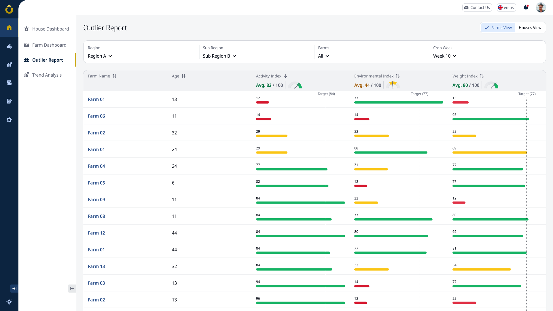
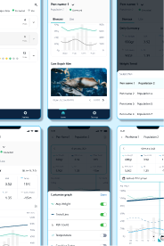
Screen Examples
These are example for screens created by multiple product designers under the guidelines our team set: